
I have to confess, I hate stitching in white. Or, more specifically, I hate stitching colors with a low contrast from the background. Seriously – it drives me crazy. That’s one of the things that drew me to this particular project, called “Redwork Quilt” by Ursula Michael. I love the idea of stitching primarily in those bright reds! The entire pattern has only four colors: three shades of red… and white. Sigh. As you can see from the photos, I haven’t yet stitched all the white background within the quilt blocks. I’ll have to do some soon. I’m hoping the fact that I can just fill in the blank spaces with white without having to count or think too much will maybe make it a bit more satisfying. We’ll see…
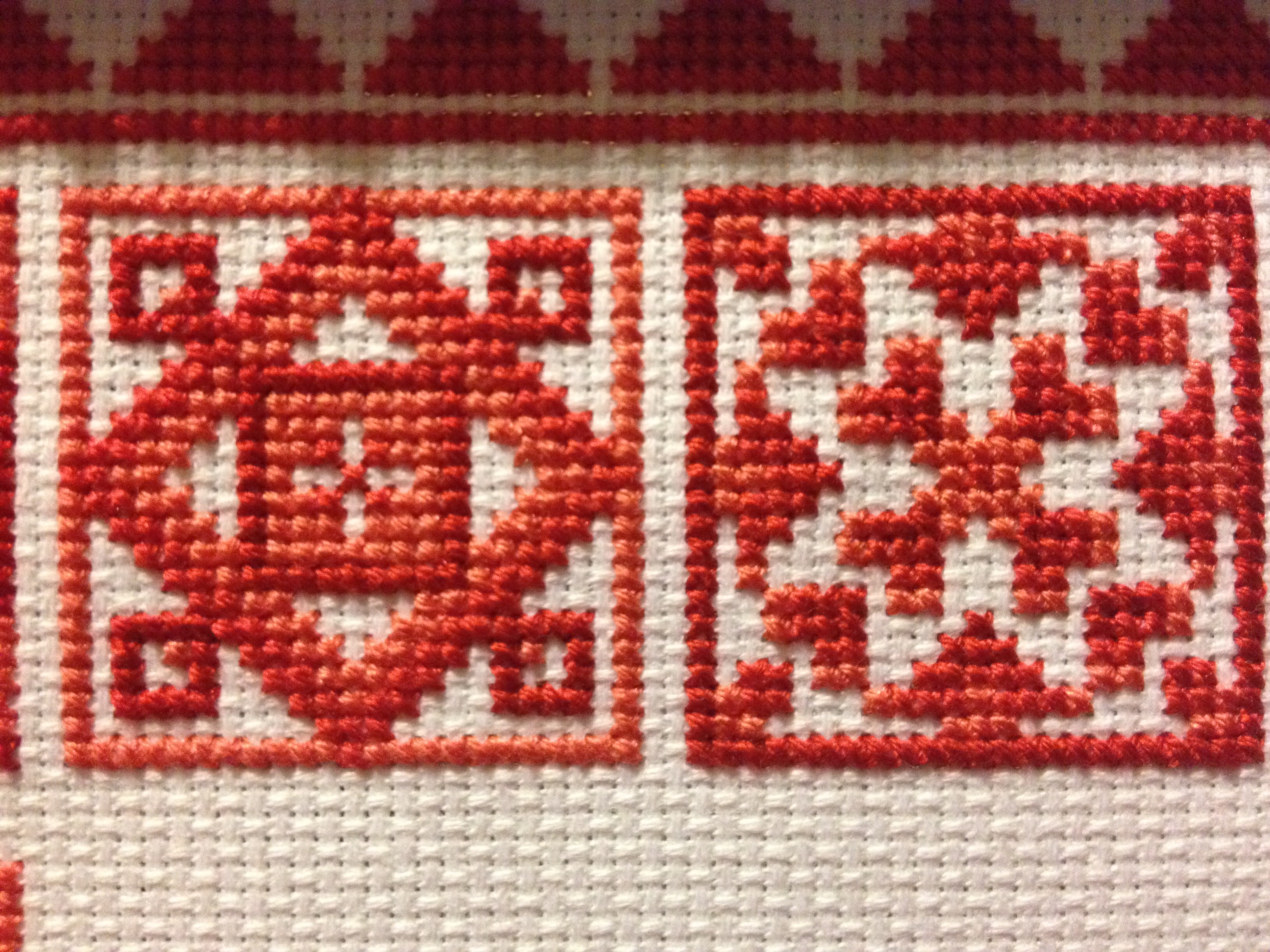
2 blocks of ‘Redwork Quilt’
When complete, the design is a border of 16 quilt blocks surrounding a backstitched birdhouse scene. I am making it as a gift for someone whose kitchen is decorated in red. However, I’m not totally crazy about the scene in the middle and may decide to do something different when I get to that point. In the meantime, I’m enjoying stitching the blocks.

I wouldn’t actually bother stitching the white ^^
I think the three shades of red look lovely.
LikeLiked by 1 person
Your blocks look great. For me when I am in your situation regarding the white. It is always nice to have one color left to fill in without worrying about counting and not making a mistake with the rest of the pattern.
LikeLiked by 1 person
This looks great. I feel the same about colour contrast between floss and fabric. I am definitely more drawn to bright colours! If I work with softer colours I have taken to using a darker colour fabric. Midnight blue is my current favourite – it provides a good contrast without being too harsh.
LikeLiked by 1 person
Thanks! I haven’t tried stitching on a darker fabric. I’ll put that on my stitching bucket list 🙂
LikeLiked by 1 person